The Evolution of the Fairware Logo: A Look Back at 20 Years of Company Growth
At Fairware, we consider our branding as a snapshot of who we are and where we’re headed. As we celebrate 20 years of creating sustainable promotional products (#Fairware20yrs), we’re taking a moment to reflect on the evolution of our logo and brand identity, and how it has grown alongside us through decades of company growth.
Version 1: The Cog and Distressed Font
Let’s rewind to the early days. Our first logo featured a cog paired with a distressed font designed by Laurel Swenson. Why a cog? It symbolized movement, progress, and the gears of change—values that were at the heart of Fairware from day one. The distressed font gave it a rugged, industrial vibe, reflecting our roll-up-your-sleeves approach to sustainability. It was bold, gritty, and perfect for a company just getting started.
Version 2: A Cleaner Look with a Teal Twist
As we grew, so did our brand identity. Enter Version 2: a cleaner, more polished logo that still kept the cog but made “Fairware” the star of the show designed by Cause & Affect. This version introduced teal as our signature colour—a nod to trust, creativity, and sustainability. We also started using washed-out, one-colour overlays on photos, giving our branding a fresh, modern feel. It was a significant step forward and a reflection of our evolving company growth.
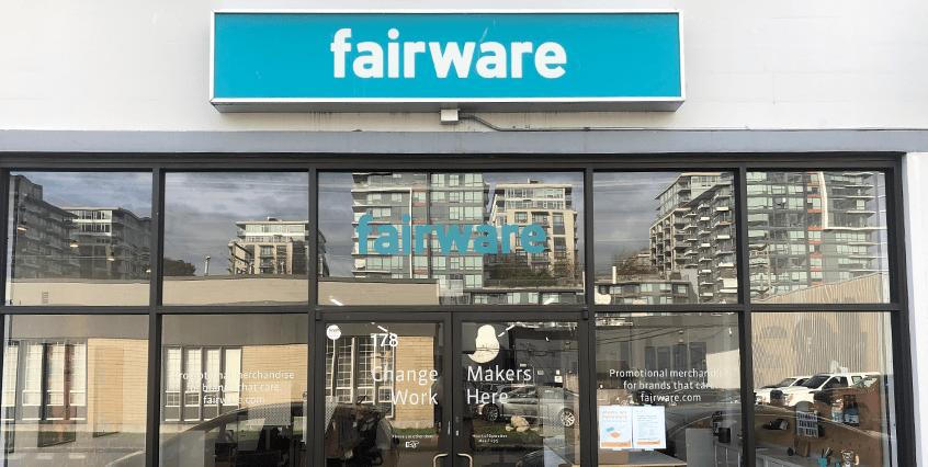
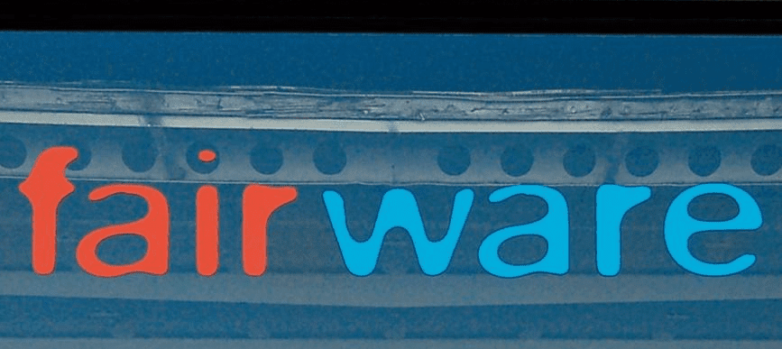
Version 3: Simplifying and Expanding the Palette
Fast forward to 2024, when we decided it was time for a refresh. Our third iteration marked a significant shift: we dropped the cog. It no longer felt relevant, and we wanted to clean up the look and feel with a focus on our wordmark only. Instead of a full overhaul, we leaned into our teal logo and expanded our colour palette to include uncoated teal and a range of blues. Teal remains our anchor, but the new palette offers us more flexibility and depth.
This refresh wasn’t just about the logo—it was part of a larger brand and website redesign, led by our Brand Manager, Nicole Tennison, and brought to life by the team at Outsmarts. Accessibility and clarity were top priorities, and we’re proud of how the new look reflects our values and makes it easier for you to connect with us. Want to know more? Check out the full story here.
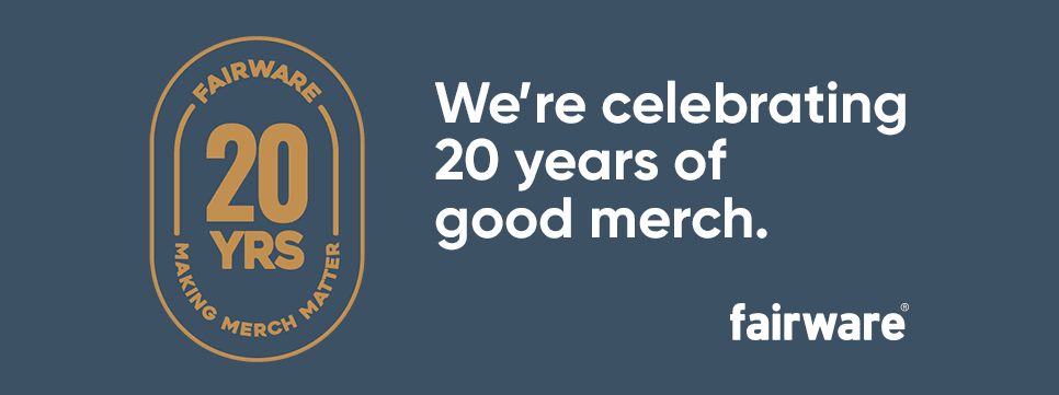
Celebrating Company Growth of 20 Years with a Special Logo
This year, we’re celebrating two decades of Fairware with a special 20th-anniversary logo. It’s a way to honour everything we’ve accomplished, the fun we’ve had, and the incredible people we’ve worked with along the way. From our early days with the cog to becoming leaders in sustainable merch, it’s been an amazing ride—and we’re just getting started.
Looking Back, Moving Forward
The growth of our logo reflects our journey as a company. Each version tells a story of growth, change, and staying true to our mission. As we celebrate #Fairware20yrs, we’re grateful for the clients, partners, and team members who’ve been part of this adventure.
Here’s to the next chapter—one that’s as bold, creative, and sustainable as ever.