Fairware’s brand refresh and new website redesign
Summary
You might notice a new look and feel to our website. Welcome! Here are a few insights on updating our brand and site.
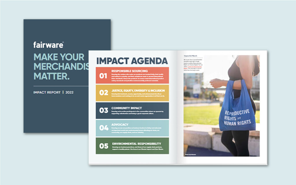
As a certified B Corporation, we prioritize doing business while considering people and the planet. Last year, we published our first official Impact Report. The report reflected an updated Fairware look and feel. Writing our Impact Report provided the opportunity to consolidate our sustainability and impact communications and showcase our goals and priorities. It also was our first public facing document with our new brand colours and feel.
With that refresh in mind, we were inspired to update our website and our suite of policies to reflect the new look and feel (and to address some issues that needed fixing on our old site). We’ve redesigned our site, policies, and internal assets to ensure our communications with vendors, team members, and clients are aligned and reflect our brand. Some changes are small and mighty, while others are new and thoughtfully implemented.
Brand Palette
Fairware has been known for its teal branding for most of the 18 years we’ve been in the promotional products industry. As we evolve, we want our colour choices to better reflect our personality as a team that lives its brand values.
Retaining a nod to our iconic teal, we expanded our primary palette to include various blue tones, such as muted navy, to convey qualities like experience, trustworthiness, and reliability. These attributes are fundamental for any sales team striving to cultivate strong client relationships through effective communication and trust-building.
Blue tones evoke feelings of stability, confidence, and sincerity, which align perfectly with our goal of being accessible industry leaders. This expanded palette adds a touch of fun and versatility to our marketing communications with a hint of playfulness and adaptability but also lends a gentler, more inviting aura to our overall brand presentation.
Secondary Colour Palette
A secondary colour palette serves several purposes within a brand’s visual identity strategy. First, it provides flexibility and versatility, allowing different colour combinations to be used across various marketing materials, products, and digital platforms while maintaining brand recognition. The palette includes earth tones of greens, yellows, and reds that complement and warm the blue tones of the primary palette.
Second, this additional palette can cater to specific campaigns, seasons, or target audiences, enhancing message relevance and visual appeal. It can be utilized to evoke different emotions or highlight different aspects of the brand personality, creating a more dynamic and engaging brand experience for customers. Overall, a secondary colour palette adds depth, adaptability, and strategic value to a brand’s visual identity toolkit.
Website Redesign
In revamping our website, we wanted to emphasize two key areas: performance and accessibility. Our goal was to make the site more efficient and to ensure that it followed the Web Content Accessibility Guidelines (WCAG) and other industry best practices. This commitment was highlighted in our 2022 Impact Report, where we outlined our intentions to create a more inclusive and user-friendly online experience.
The refreshed website is designed to be dynamic and engaging, with a focus on showcasing our client work, product lookbooks, core services, and our new trend shops. These trend shops are a highlight, featuring a curated collection of top sellers that will be continuously updated. Their purpose is to provide our clients with a starting point to explore and select products from a smaller subset of our overall offering, making it easier for them to discover new trends and products that resonate with their needs and preferences.
By prioritizing performance and accessibility in our website refresh, we’re not only enhancing the user experience for all visitors but also demonstrating our commitment to creating an inclusive and accessible online platform that caters to the diverse needs of our audience. As stated in our website’s Accessibility Policy, we are committed to an ongoing process of improving and maintaining the accessibility of our site. This includes regular reviews, updates, and enhancements to ensure that we continue to meet and ideally exceed accessibility standards. Your feedback is invaluable in this journey, so please don’t hesitate to reach out if you encounter any accessibility barriers or have suggestions for further improvement. Together, we can create a more inclusive and accessible online experience for everyone.
Conclusion
Fairware’s website redesign is not just about a new look and feel; it’s about aligning our digital presence with our brand values and commitments as a Certified B Corporation. Through this process, we’ve updated our visual identity, improved performance, and enhanced accessibility to ensure our online platform reflects inclusivity and user-friendliness. As North America’s sustainable merch brand, we’re proud of our new site and refreshed brand, confident that they embody our ethos. Navigate around fairware.com and let us know what you think. Your feedback is invaluable as we continue to strive for improved sustainability, accessibility, and user experience.